ABOUT TRUGO
Trugo is an application developed for electric vehicle users. This application allows vehicle owners to find charging stations belonging to Togg and to charge their vehicles with this application.
1
2
3
PROJECT GOALS
How I started the process in the project, how I progressed, what I did at which stages.

Solving Problems
I solved the application’s mistake that killed the user experience. I created personas that appeal to all audince.

Better User Experience
I worked on improving and simplifying the existing experience in the application

Different Personas
I made user analysis and created personas to improve and customize the user experience of the application.

Modern Interface and Branding
I gave it a modern interface with a consistent icon set and compatible fontscale.
EMPHATIZE
RESEARCH 5W
Who uses the EV Charging station application?
- EV owners who needs to charge their electric vehicles
- People who are interested in purchasing an electric car in the future
- Business that offer EV charging services to their employess or customers
What do they use the EV Charging station application?
- To locate nearby charging stations and check their availability
- To plan routes based on charging stations along the way
- To monitor the status of their charging session and receive notifications when the charging is complete
- To make payments for charging services and view their charging history
- To find information about the charging network, such as pricing, station services and connector types
When do they use the EV charging station application?
- When they need to charge their electric vehicle on the go
- Before a long road trip to plan their route and make sure they have enough charge to reach their destination
- When they want to check the availability of a specific charging station or plan their charging schedule
- When they want to view their charging history or make payments for charging services
Where do they use the EV charging station application?
- On their mobile device, such as a smartphone or tablet
- On the road, to locate charging stations and plan their route
Why do they use the EV charging station application?
- To ensure that they have a reliable and convenient way to charge their electric vehicle
- To save time and avoid potential charging delays or issues
- To reduce their carbon footprint and support sustainable transportation
- To stay up-to-date with the latest developments in the EV industry and charging infrastructure.
COMPETITORS
Strength
- UI design is good
- Easy to use
- Route creation for long journeys
- It can see all charging stations regardless of brand.
- It provides in-app map navigation.
Weakness
- Verification code problem
- No fault notification
- No booking option
- No quick filter
Strength
- UI design is good
- Quick filter option
Weakness
- Software bugs
- Verification code problem
- No fault notification
- No booking option
DEFINE

SECONDARY RESEARCH
I analysed the user reviews of Voltla and Zes applications on Play Store and App Store and compared the competitors accordingly.


EMPHATY MAP

Name: Yalçın Özhan
Age: 52
Job: Fruit exporters
Family Status: Married with two children
Location: Gaziantep
Application Usage: Instagram, Facebook
Needs
- Convenient, reliable, and fast charging for her electric vehicle
- Easy-to-use mobile application
- Preference for an application that can respond quickly
Goals
- Yalçın owns an electric car and wants to be able to find charging stations near his home and work to avoid running out of power.
- He wants to have a seamless experience when using the app to locate, reserve and pay for a charging station.
- His job requires him to go out of town frequently, and during these trips he would like to see the charging stations along his route.
Frustration
- Yalçın is concerned about the availability and reliability of charging stations, as well as the cost of using them.
- He may have limited time to charge her vehicle during the day, so he needs to quickly find and access and making reservation a charging station.
- He doesn’ want to consuming about the sign-up and login process time- and complicated.
IDEATE
CUSTOMER JOURNEY MAP
Sign-up and login
Search and find
Reserve and pay
Needs
- Create an account and log in to access the app’s features.
- Find the nearest EV charging station and check its availability.
- Make reservation
- Reserve a charging port and pay for the charging service.
Do not make the payment screen complicated.
Potential Negatives
- The sign-up and login process may be time- consuming and complicated.
- Difficulty remembering login information.
- Struggle to find a charging station that’s available and within a reasonable distance.
- Difficulty reserving a charging port.
- Already be reserved by another user.
Solution
- Make the sign-up and login process as easy and straightforward as possible, such as using social media logins or simplified
- Provide a clear and concise app description that highlights the benefits of the app and its features.
- Allow the user to explore the app, don’t require member login until the checkout screen.
- Show real-time availability of charging ports.
- Show nearest station within using quick filter and show station cards.
- Provide a map view with clear directions to the chosen charging station.
- Allow users to make a reservation in advance
- Provide a secure and user-friendly payment system, with transparent pricing information.
- Make avaible NFC for payment.
DESIGN
STYLE GUIDE
Colors
#00C2E7
#000050
#090631
#231F20
#3E6BA1
Icons
Font and Typescale
Noto Sans
Noto is a global font collection for writing in all modern and ancient languages. Noto Sans is an unmodulated (“sans serif”) design for texts in the Latin, Cyrillic and Greek scripts, which is also suitable as the complementary choice for other script-specific Noto Sans fonts. It has italic styles, multiple weights and widths, and 3,741 glyphs.
Light
Regular
Semi Bold
Bold
24 px
20 px
18 px
16 px
14 px
12 px
PROBLEMS
Problem
This navigation bar does not provide any information to the user. Information required to use the design (e.g. field labels or menu items) should be visible. The icons are also stylistically inconsistent, creating a visual incoherence.
Solution
I minimized the user’s memory load by making elements, actions, and options visible. The user should not have to remember information from one part of the interface to another. Information required to use the design (e.g. field labels or menu items) should be visible. I created new Nav Menu bar and a new set of icons that are compatible with each other. I also gathered the hamburger menu and settings menu under the “Account” heading. I eliminated this problem by using this set of icons and the headers of the redirects together.
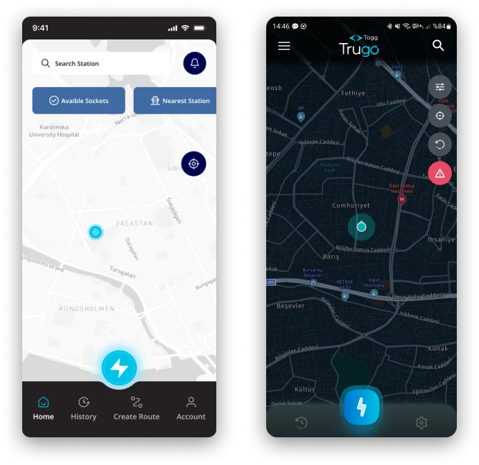
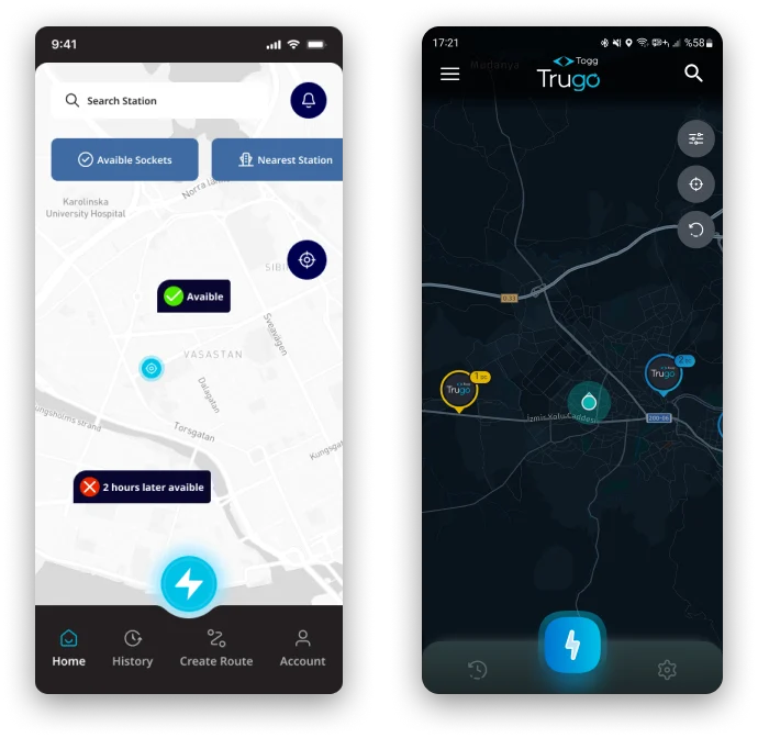
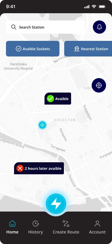
Problem
Users should not have to wonder whether different words, situations, or actions mean the same thing. For this, station situations should be described with colors and icons that are familiar to the user’s experience rather than brand colors or brand logo.
Solution
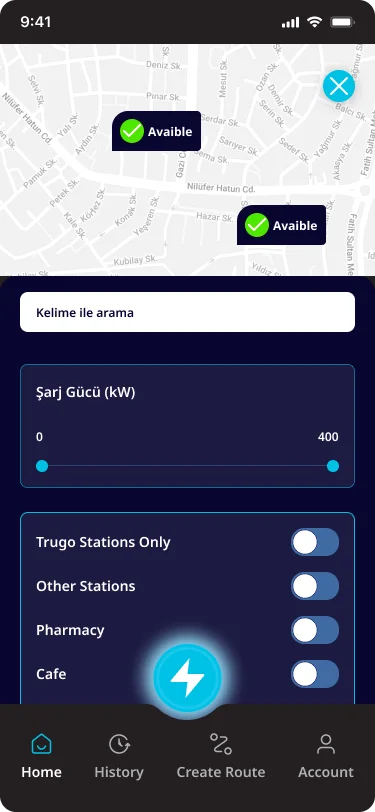
I recreated the station pins. I colored the station states according to what the user is familiar with and chose icons accordingly to reduce user burden. To eliminate negative perceptions, I gave the user a choice by indicating when the station state that is not available is available. I also chose a map with street details to help the user recognize station locations by showing familiar places. I also changed the map color to gray and white to create depth and reduce visual intensity.
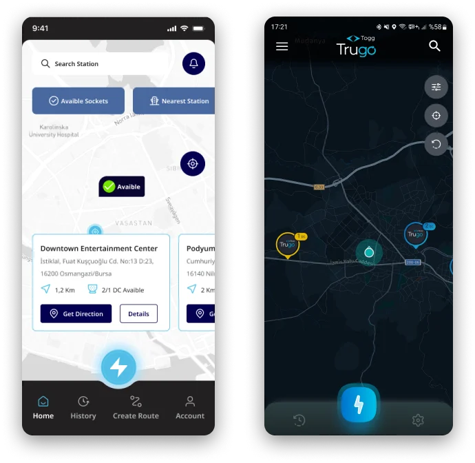
Problem
Allow users to adapt common actions. Flexible processes can be performed in different ways, so people can choose the method that works for them. Based on this rule, the Home page I analyzed does not have any action prompts that users can perform frequently. Also, the Filter button should be combined with the search button so that the user understands that they can search with this method.
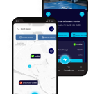
Solution
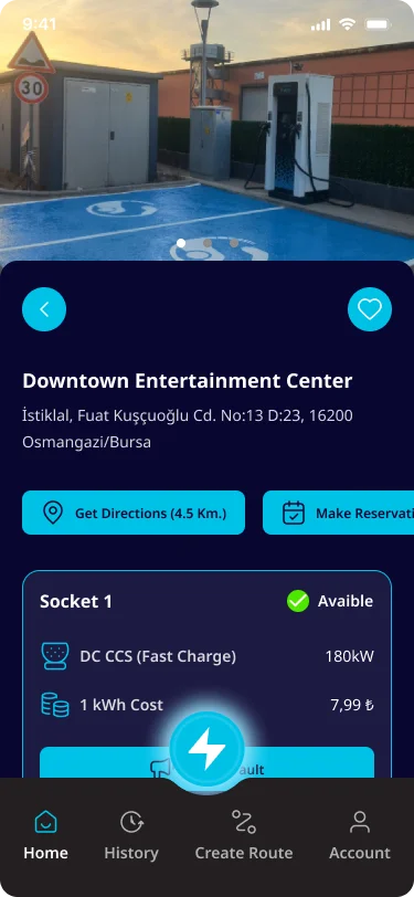
I created filter buttons for users to quickly see available sockets, nearest stations and dc, ac sockets. I reorganized the crowded stack of buttons on the right side, moving the filter button into the station search bar to allow detailed filtering in a new area. I made the notification button for new stations, app updates or news to be used in the user’s familiar touch area so that the user does not miss notifications. When the user clicks on the quick filter button, I created a card view so that the user can access the information of the relevant station. Thanks to these cards, I prepared directions where the user can see how many sockets are available at the station, directions to this station and details.
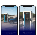
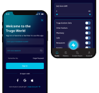
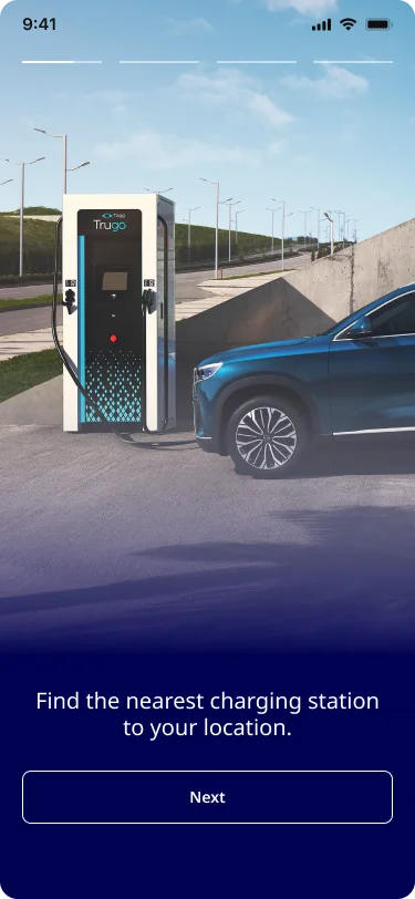
ONBOARDING SCREENS
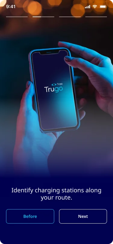
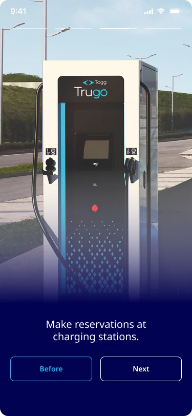
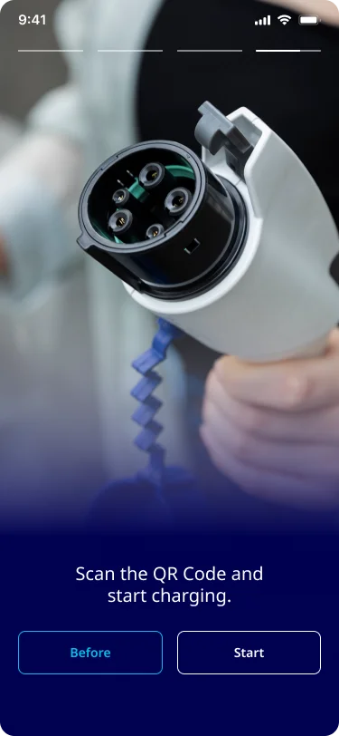
HOME, STATIONS, LOGIN, SEARCH & FILTER
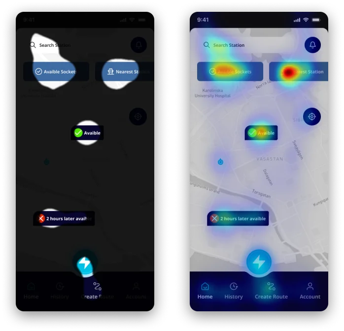
TEST
TEST SCREENS
When I tested the current version of the design and the improved versions of the design with the Clueify tool, you can see the improvements in both the heat map and the focus map.
Areas that were not focusable in the current version have been turned into focus points in the improved version. We see that the uneven focus points in the current version are evenly distributed in the improved version.
Current Version
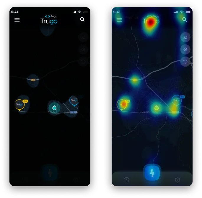
Improved Version