Trugo
UI-UX Tasarımı, Ürün Tasarımı
2024
Technology
Research 5W
- Electric vehicle owners who need to charge their electric vehicles
- People who want to buy an electric car in the future
- Businesses offering electric vehicle charging services to their employees or customers
- To find nearby charging stations and check their availability
- Planning routes based on charging stations along the way
- To monitor the status of charging sessions and receive notifications when charging is complete
- To pay for billing services and view billing history
- To find information about the charging network, such as pricing, station services and connector types
- On their mobile devices such as smartphones or tablets
- On the road, to find charging stations and plan their route
- Ensure they have a reliable and convenient way to charge their electric vehicles
- To save time and avoid possible charging delays or problems
- To reduce carbon footprints and support sustainable transportation
- To be informed about the latest developments in the electric vehicle sector and charging infrastructure.
Competitors

- Good user interface design
- Easy to use
- Creating routes for long journeys
- It can see all charging stations, regardless of brand.
- Provides in-app map navigation.
- Verification code issue
- No failure notification
- No booking option
- No quick filter

- Good user interface design
- Quick filter option
- Software bugs
- Verification code issue
- No failure notification
- No booking option
Secondary Research





Customer Journey Map
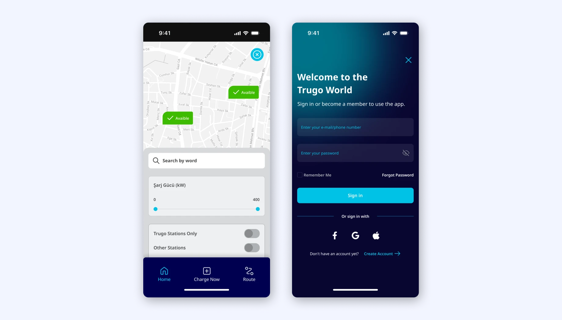
- Create an account and sign in to access the app's features.
- Find the nearest electric vehicle charging station and check its availability.
- Make a booking
- Reserve a charging port and pay for the charging service.
- Do not complicate the payment screen.
- The registration and entry process can be time-consuming and complex.
- Difficulty remembering login credentials.
- Struggle to find a charging station that is convenient and within reasonable distance.
- Difficulty booking a charging port.
- It's already booked by another user.
- Make the registration and login process as easy and straightforward as possible, e.g. use or simplify social media logins
- Provide a clear and concise app description that highlights the benefits and features of the app.
- Let the user explore the app, don't require login until the checkout screen.
- Demonstrate real-time availability of charging ports.
- Show the nearest station using a quick filter and show station cards.
Provide a map view with clear directions to the selected charging station.
- Allow users to make advance bookings
- Provide a secure and user-friendly payment system with transparent pricing information.
- Make NFC available for payments.
Style Guide
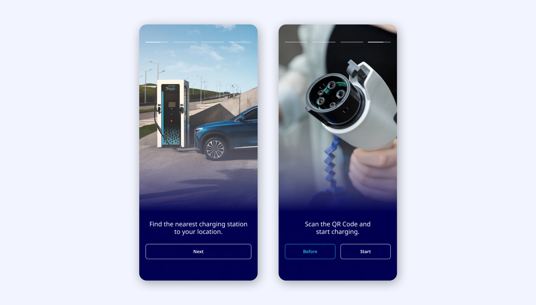
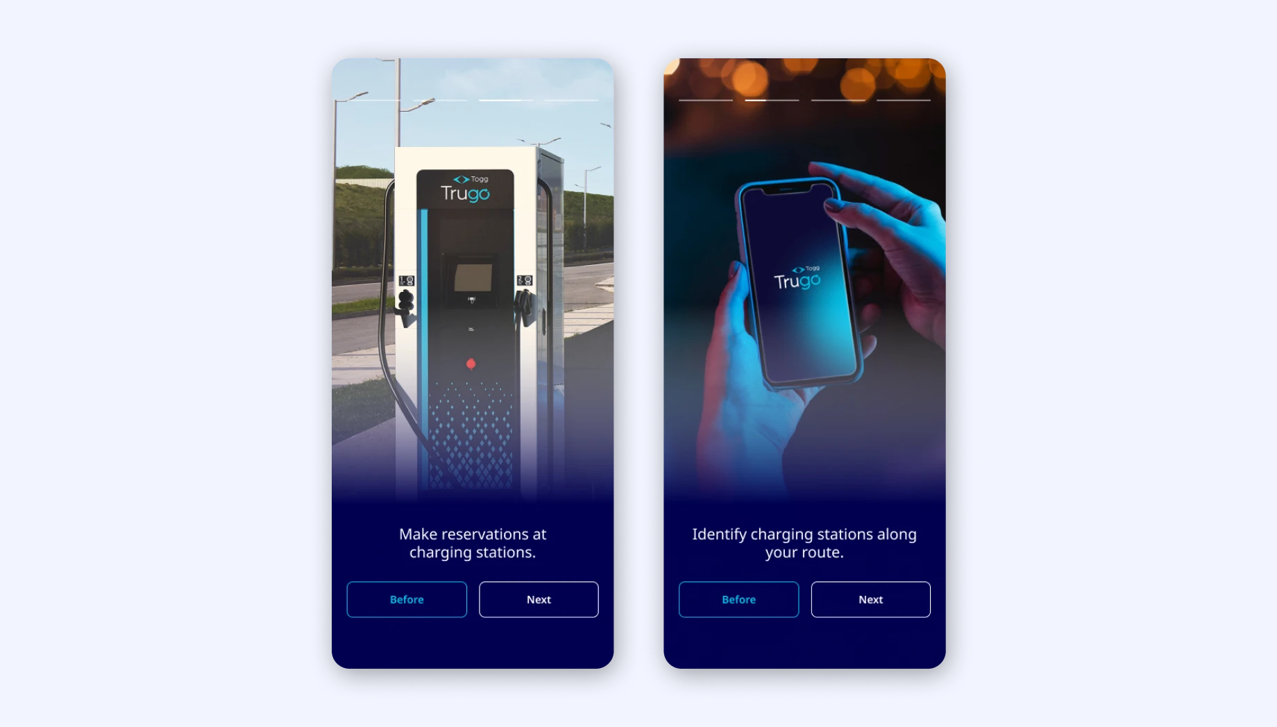
Onboarding Screens
First, let's discuss my analysis of the app's user interface. In doing so, let's evaluate it with Jakob Nielsen and the 10 Principles of Heuristic Analysis.
Improvements in interface design are as follows:
- Recognition rather than recall
- Consistency and standards
- Flexibility and efficiency of use
- Aesthetic and minimalist design
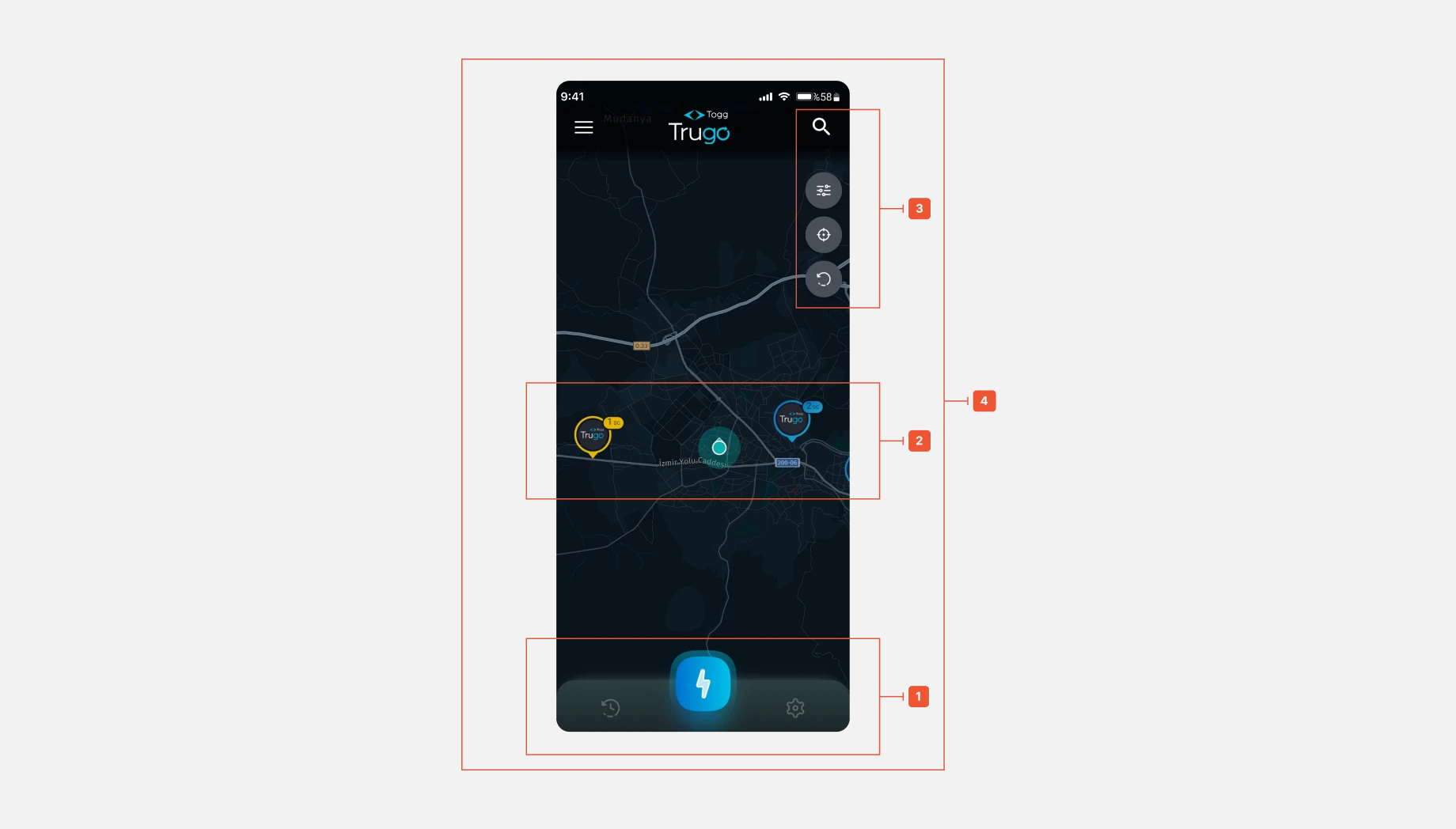
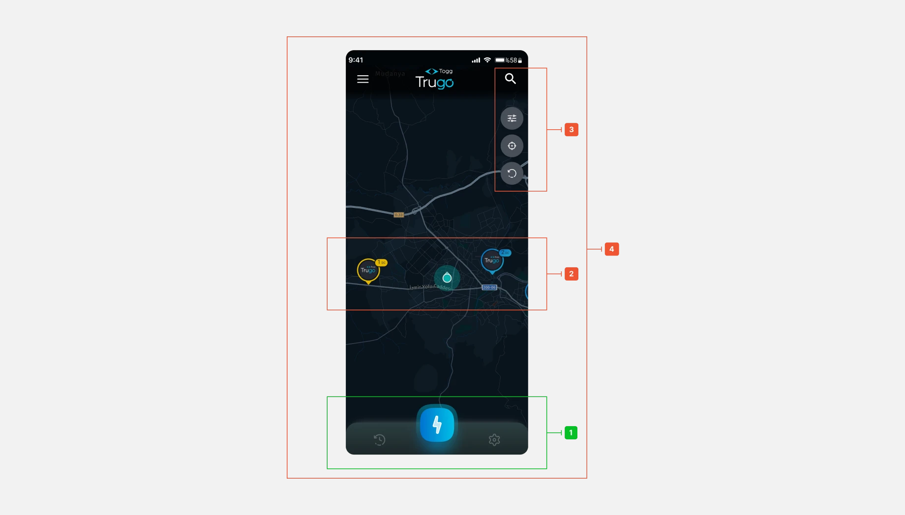
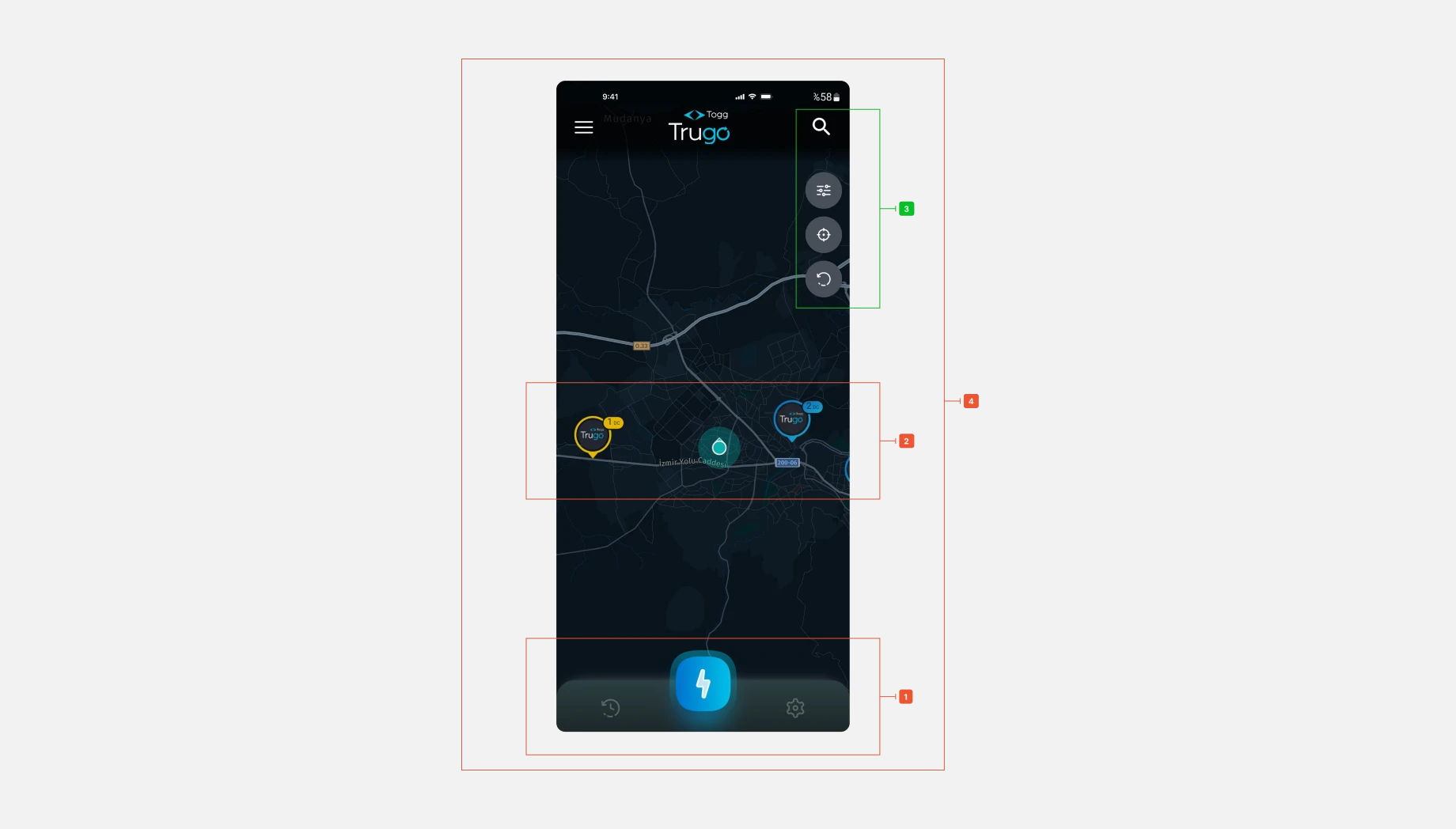
This navigation bar does not provide any information to the user. The information needed to use the design (e.g. field labels or menu items) should be visible. The icons are also stylistically inconsistent and create a visual dissonance.
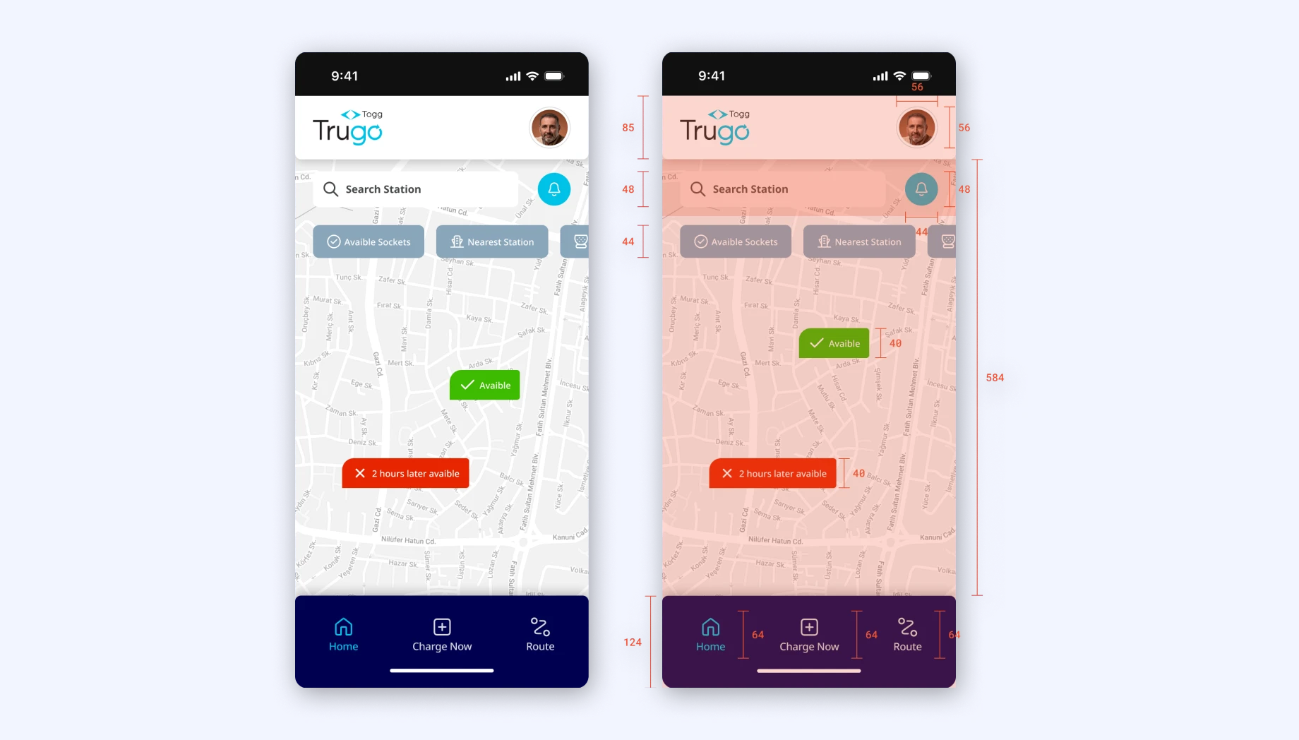
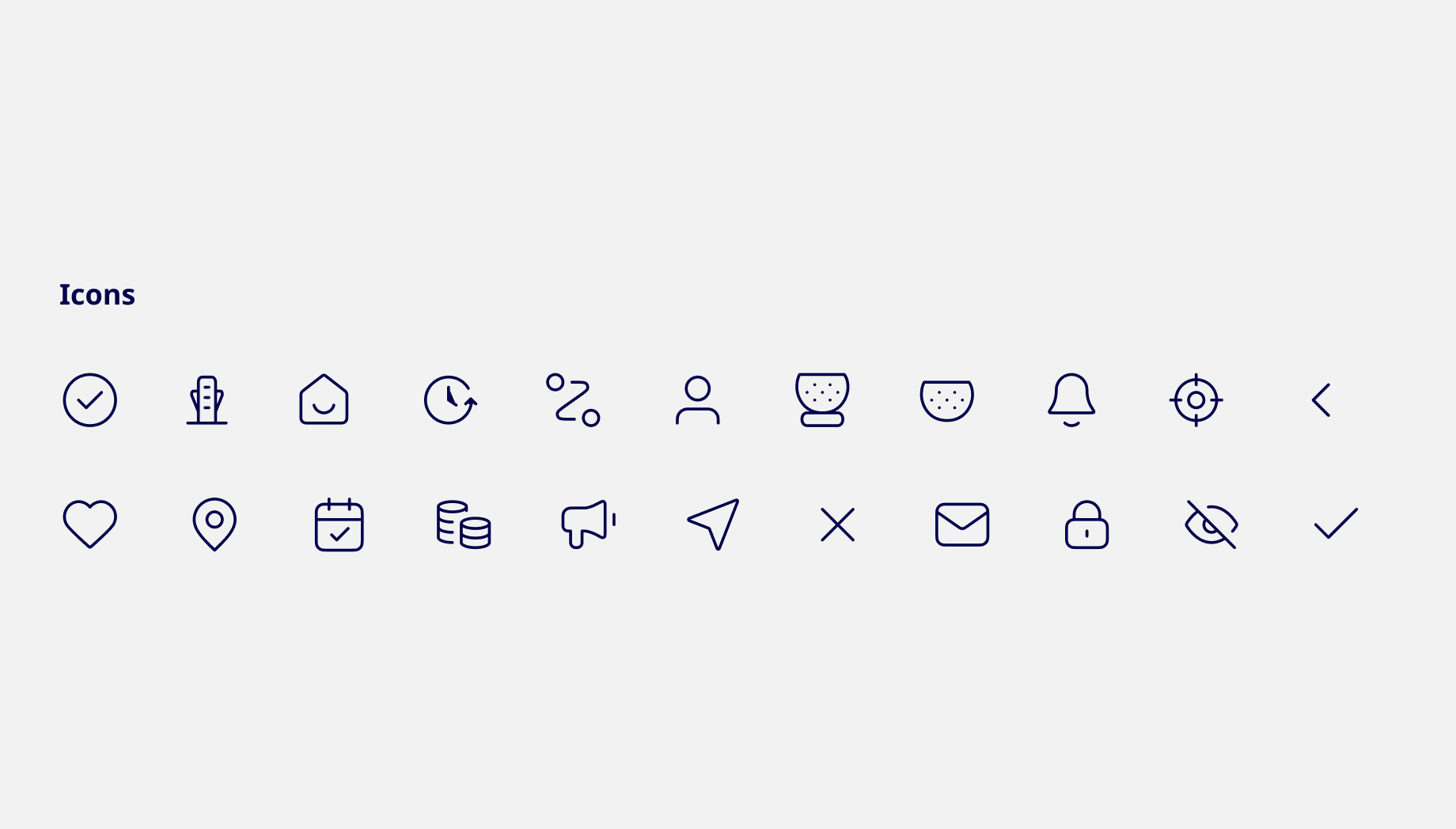
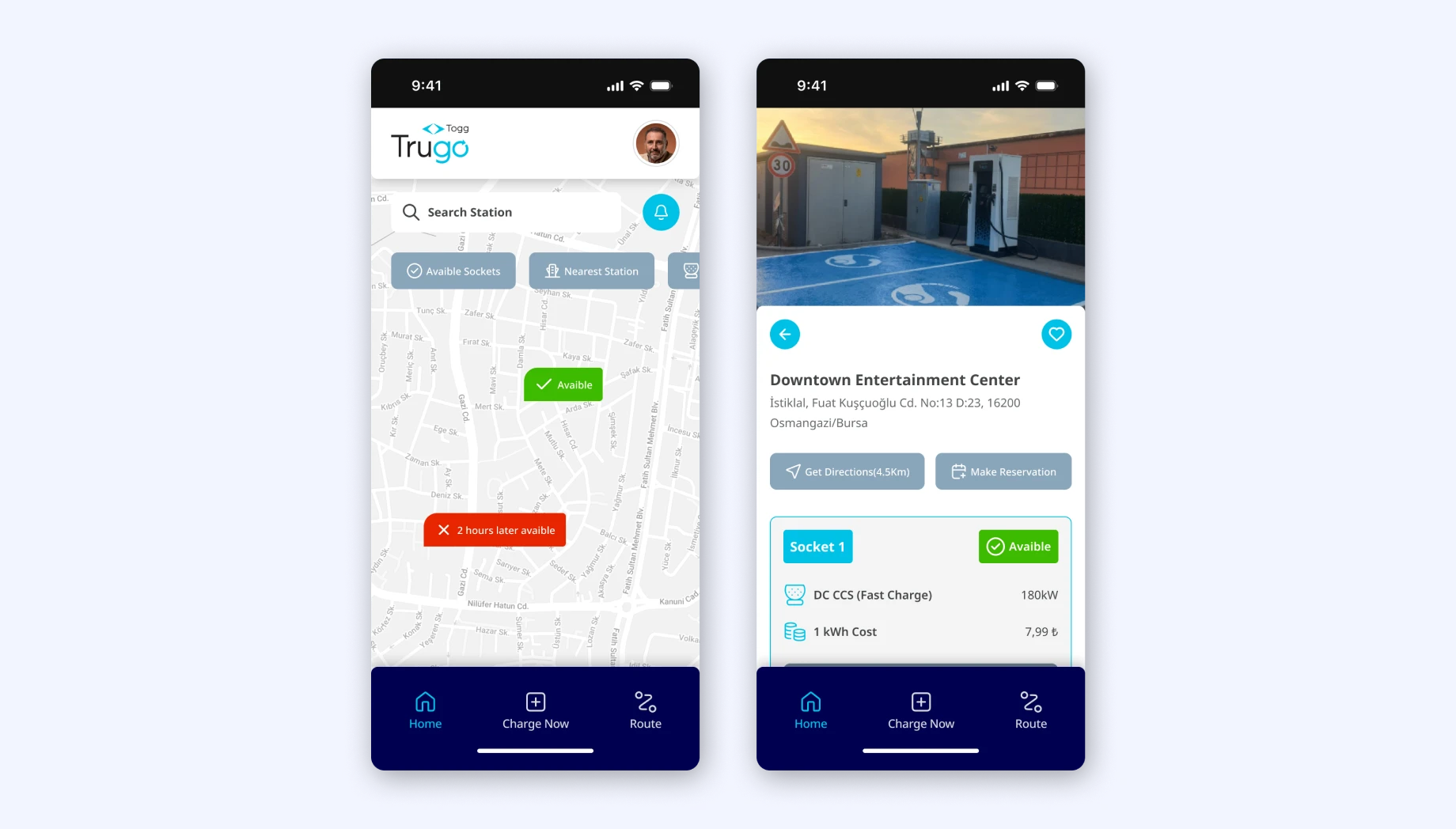
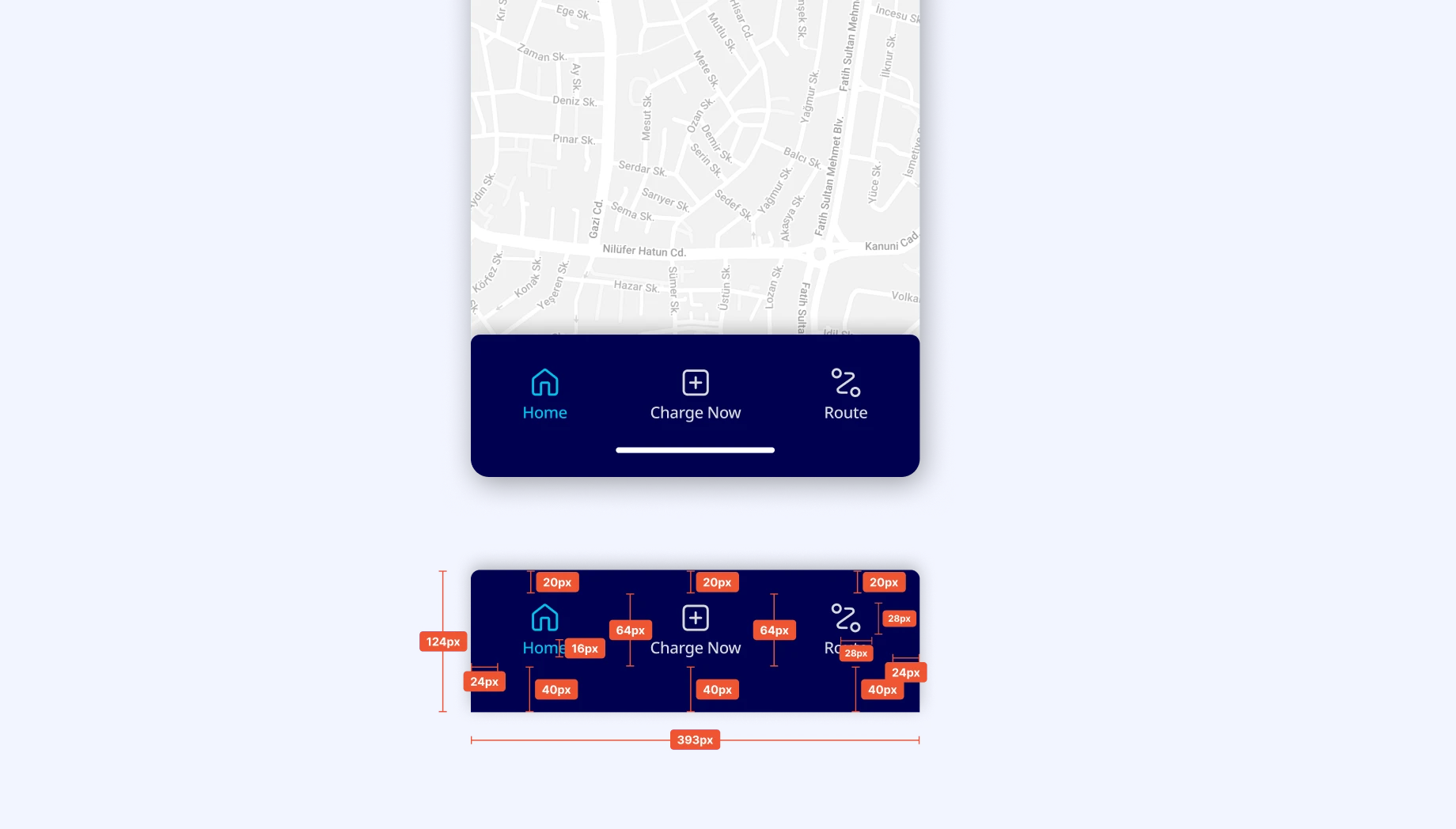
I minimized the user's memory load by making elements, actions and options visible. The user should not have to remember information when moving from one part of the interface to another. The information needed to use the design (for example field labels or menu items) should be visible. I created a new Nav Menu bar and a new set of icons that are compatible with each other. I also grouped the hamburger menu and the settings menu under the heading “Account”. I eliminated this problem by using this set of icons and the titles of the redirects together.
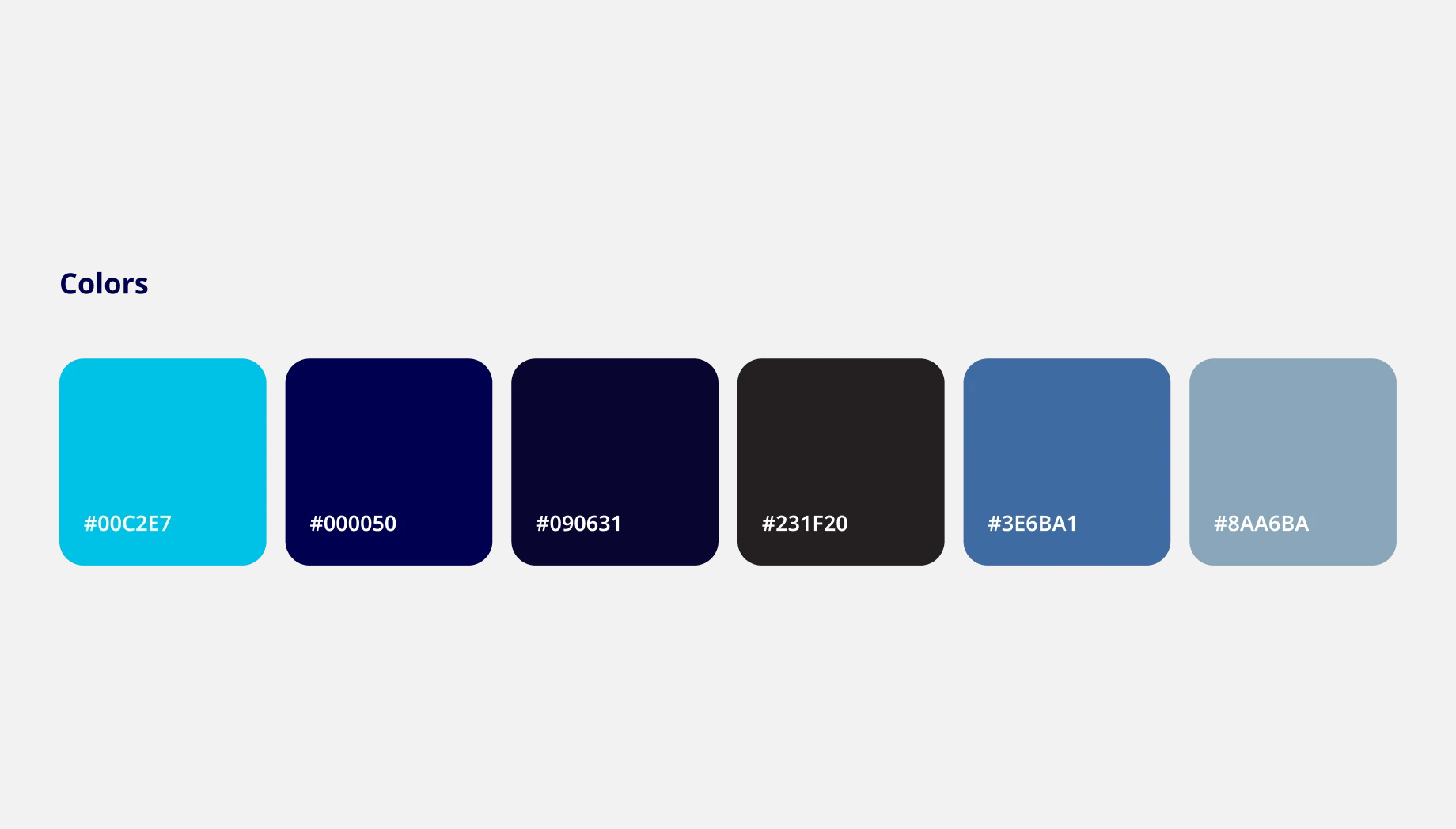
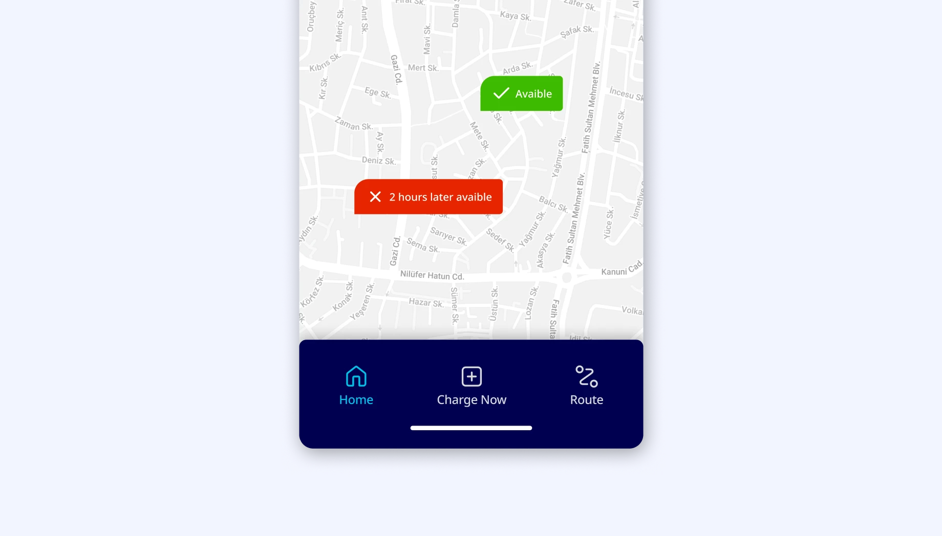
Users should not have to wonder whether different words, situations or actions mean the same thing. For this, station states should be described with colors and icons that are familiar to the user's experience, rather than brand colors or brand logos.
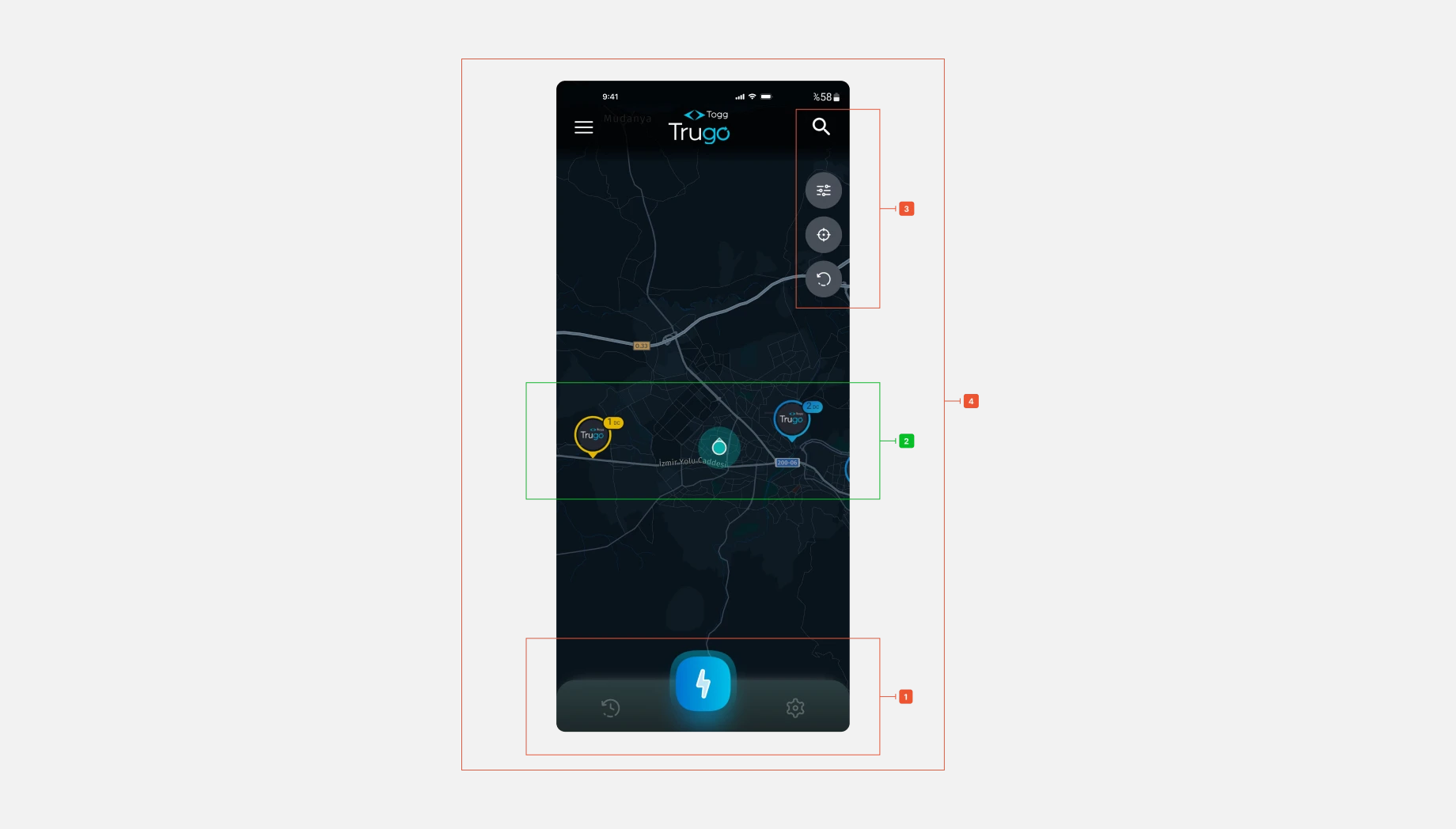
I recreated the station pins. I colored the station states according to what the user is familiar with and chose icons accordingly to reduce user load. To eliminate negative perceptions, I gave the user a choice by indicating when a station state was available when it was not. I also chose a map with street details to help the user recognize station locations by showing familiar places. I also changed the map color to gray and white to create depth and reduce visual density.
Allow users to customize common actions. Flexible actions can be performed in different ways, so people can choose the method that works for them. Based on this rule, the Home page I analyzed does not have any prompts for actions that users can perform frequently. Also, the Filter button should be combined with the search button so that the user understands that they can search with this method.
I created filter buttons so that users can quickly see available outlets, nearest stations and dc, ac outlets. I reorganized the crowded stack of buttons on the right side and moved the filter button to the station search bar to allow detailed filtering in a new area. I made the notification button for new stations, app updates or news to be available in the user's familiar touch area so that the user doesn't miss notifications. I created a card view so that when the user clicks on the quick filter button, they can access the information of the relevant station. With these cards, I created directions where the user can see how many sockets are available at the station, directions to this station and details.
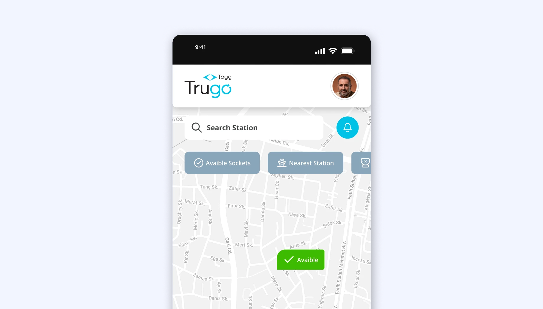
Which problems have we solved?
- Navigation bar design and improvement
- Visually inconsistent icon style
- Search bar design
- Station icons design
- Quick filter optimization
